Designer Visions: Thom Filicia and The Big Chill
by habituallychic
11 . 10 . 09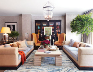 By now, most of you have probably seen the November 2009 issue of House Beautiful that features Thom Filicia‘s fabulous Designer Visions Showhouse. I was treated to a private tour of all the showhouses a few weeks ago and I can tell you that they are even more spectacular in person! This year, each designer was asked to choose a movie that would act as their inspiration and Thom chose The Big Chill. It’s not a literal translation though, Thom imagined that the owners of the house in the movie, The Coopers, had grown up and decided to buy a pied a terre in downtown New York where they could entertain their friends while in town.
 This showhouse is located in the new Soho Mews building in Soho. What is unique about this space is that it’s actually a two story townhouse. You can enter either from a private door on Wooster Street or through the main entrance on West Broadway which leads to the back garden entrance. It’s the best of both worlds since it has a doorman to sign for packages but also offers privacy from the rest of the building.
 It was a lot of fun to see how each of the three designers interpreted the three townhouses since they each have very similar floorplans. I think showhouses are a great source of inspiration and I took away a lot of ideas from Thom Filicia’s space. It looks like someone else was also inspired enough to buy this particular townhouse. I just hope they bought it completely furnished!
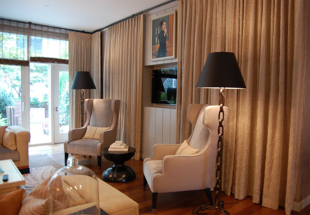
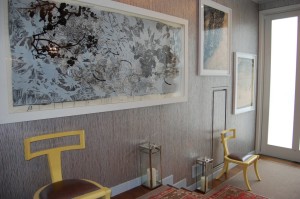
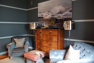
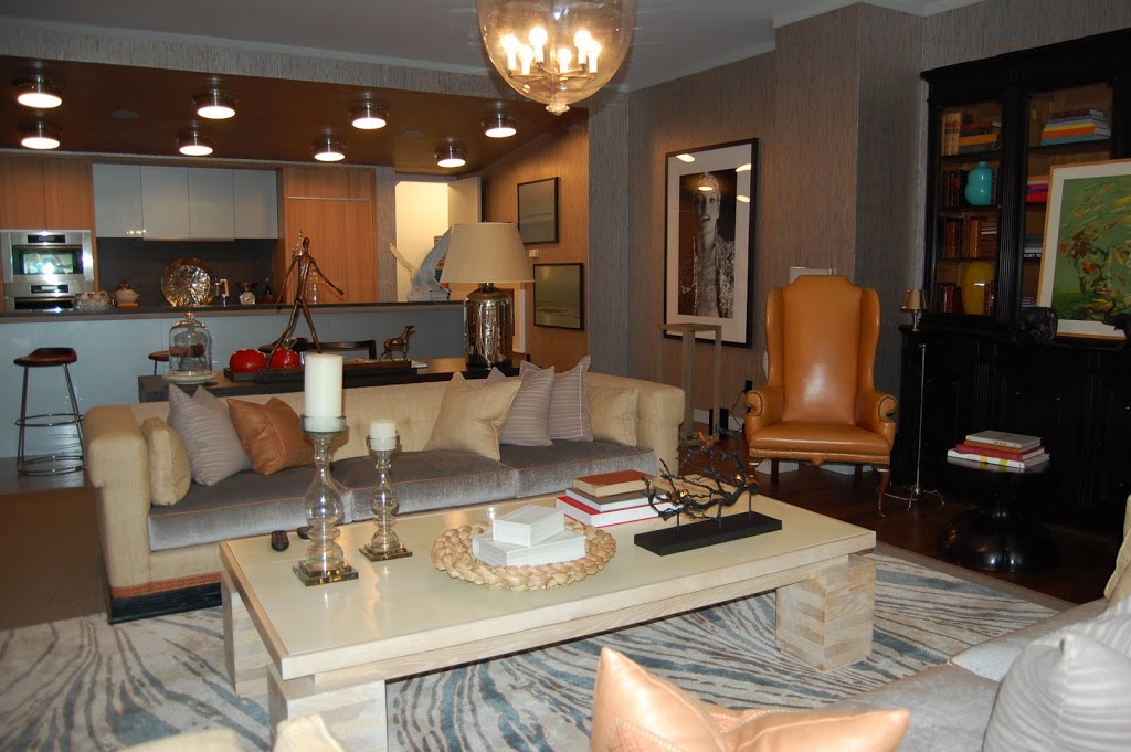 The living room sits directly off the private back garden and is open to the kitchen. I’m not a fan of open kitchens since you can’t hide anything but if this is just a pied a terre home, perhaps they usually eat dinner out. I am also not a fan of new modern apartments since they are usually a plain white box but Thom did a really job warming it up with the Philip Jeffries wallpaper that extends all the way to the back of the first floor.
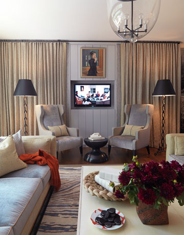 He also warmed up the space with draperies like these that hide the television when it’s not in use. All of the fabrics and colors were warm and cozy feeling and the sofas looked comfortable and inviting.
 You can see in this photo the door that leads out to the garden. There are also sliding doors as well.
 Each of the designers considered the movie characters their muses and I was amazed at the level of thoughtful details including in the showhouse. In Thom’s space, there was even mail addressed to the Coopers sitting out!
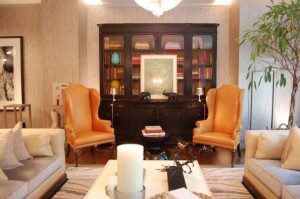
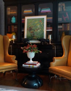
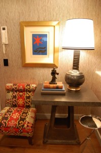
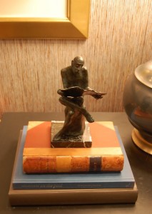
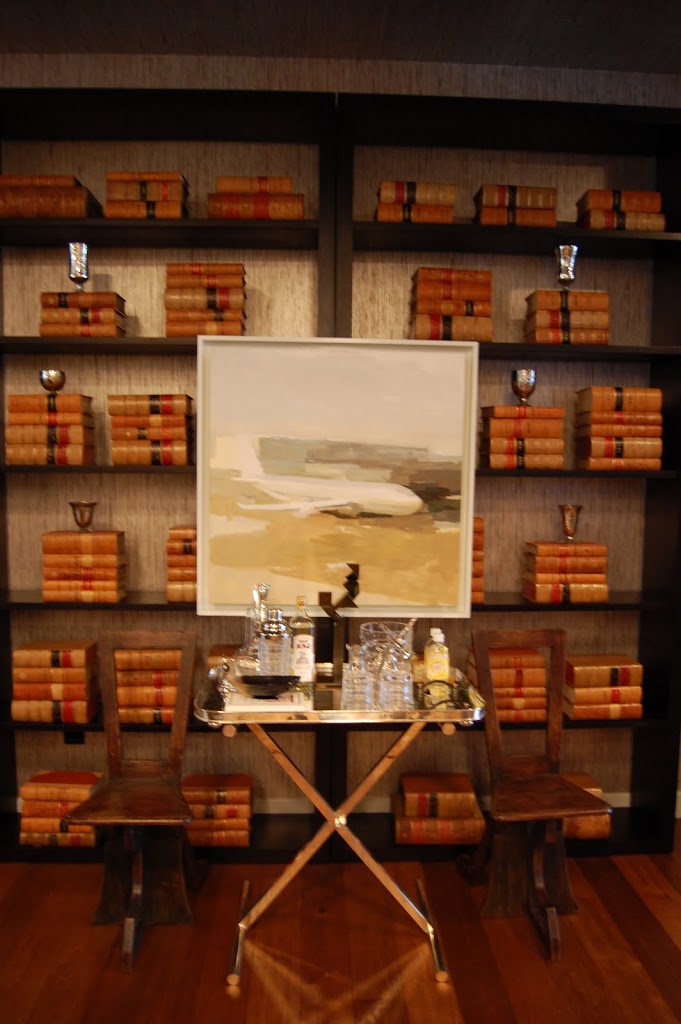 If these were my bookshelves, they would be packed with art and design books but I love how the styled books look with the mercury glass vases. I also like that they are open so you can see the wallpaper behind them. This area sits right near the kitchen so it was a perfect location for the bar.
 When I saw this painting by Robert Moody in person, I didn’t immediately notice the airplane. The artwork through out the apartment beautifully finishes off the design. Much of it relates to the fact that the Coopers main house is located in South Carolina with seascapes hung the opposite kitchen wall and along the stairwell.
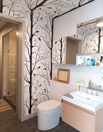 It’s always interesting to think of how you would have designed a particular space. I probably wouldn’t have chosen such a graphic wallpaper but it adds a touch of whimsy to the downstairs bathroom. In House Beautiful, Thom says that he wouldn’t want to get up every morning and look at it but that it’s like a gift for your guests since it’s on the first floor.
 The pattern even extends to the ceiling which draws your eye all the way to the back of the room.
 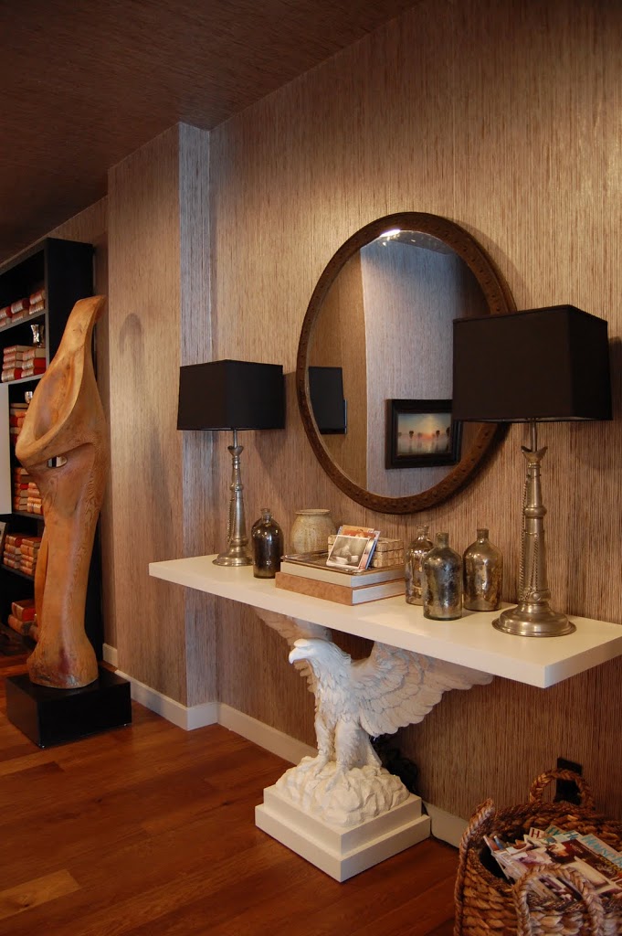 I always enjoy walking through a space to see how designers deal with the floorplan and I love how Thom used the long wall between the living room and the back entrance for display. This Eagle Console is one of his designs for Vanguard and the white looks wonderful highlighted against the darker wallpaper.
 My absolute favorite aspect of the entire showhouse is the Philip Jeffries Zebra Grass Wallpaper in Iced Cappuccino. It’s a mix of silver metallic and natural stripes that undulates down the wall.
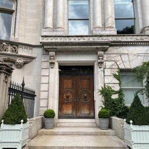
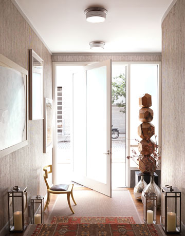 Another pretty look at the entry foyer. I can’t decide if I like how the door opens or not.
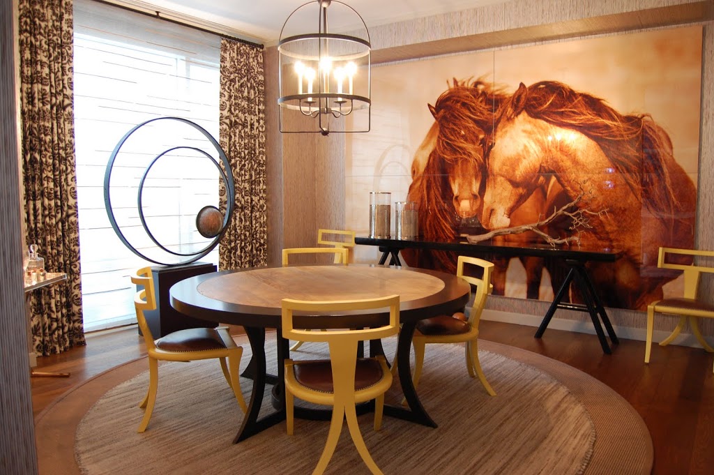 Here’s a look at how the dining room off the entry looked when I visited. The photo by Roberto Dutesco adds a lot of drama but the sepia tones are also calming. I really love the round rugs look layered under the round table designed by Thom.
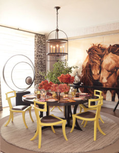 Here’s the room styled for House Beautiful. See how much styling makes a difference!
 Now that I think about it, I think my absolute favorite design idea from the Thom Filicia’s showhouse is the rope hand rail! Sometimes this type of hand rail doesn’t meet building code requirements but you can put up a regular hand rail and change it out after the inspection. But you didn’t hear that from me! I also love how the striped carpet runner is pushed to the right which makes the exposed wood another stripe! Genius!
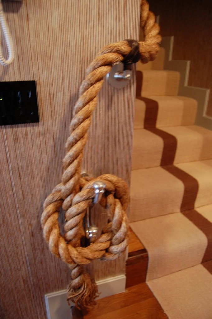 I love how it looks tied around the cleat. Another great reference to the water and sailing for The Coopers.
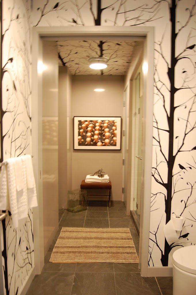
 The upstairs landing has a lovely seating area. There is a door to the left that leads into the common hallway of the building where the regular apartments are located. There is also a laundry room off of this landing as well as another bedroom and bathroom that were not part of the showhouse.
 Everywhere you looked was another fabulous tablescape or interesting detail!
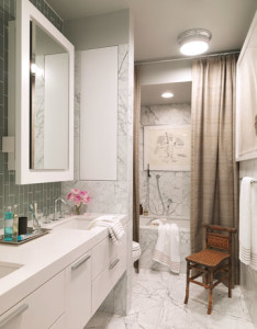 The master bathroom is along the hallway to the bedroom. I liked how Thom warmed up the modern bathroom with the natural fabric shower curtain and little chair.
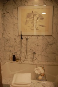 It might not be practical but I always love artwork in a bathroom!
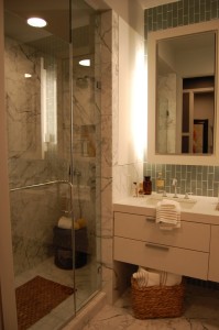 On the other side of the room is an enclosed shower.
 New modern buildings don’t have many or actually any architectural details like mouldings so Thom applied horizontal bands around the room to add visual interest. The idea was based on the stone detail usually found on Beaux-Arts buildings.
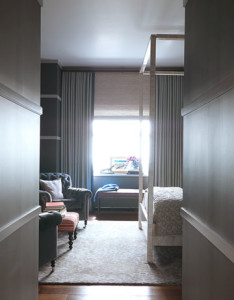
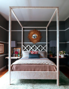 I thought it was interesting that he chose the bone four poster bed for the room since I thought it would interfere with the bands but it ends up looking great.
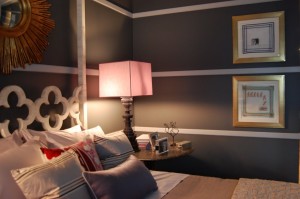
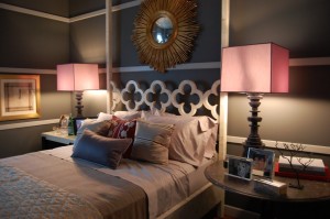 I don’t think the lampshades are really pink in person but ended up looking so in my photo. I actually like it as a contrast to the dark grey Ralph Lauren paint in Palais Royal.
 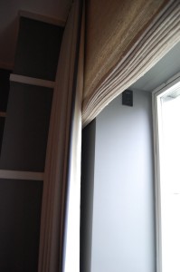 The one window in the room is just a square box with no architectural details so the window treatments were extended to the wall to create the illusion of a larger window.
 Another one of my favorite pieces in the showhouse were the handkerchief artwork by Angel Delgado. He learned the art form from other prisoners while he was incarcerated for six months in Cuba.
 Here is the wall opposite the bed styled for House Beautiful.
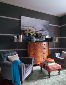
 It still looks nice unstyled. I love the contrast of the warm wood dresser, velvet chairs and shiny silver lamps. Included in the room are textiles that are supposed to reflect that The Coopers are world travelers who brought back souvenirs from their trips.
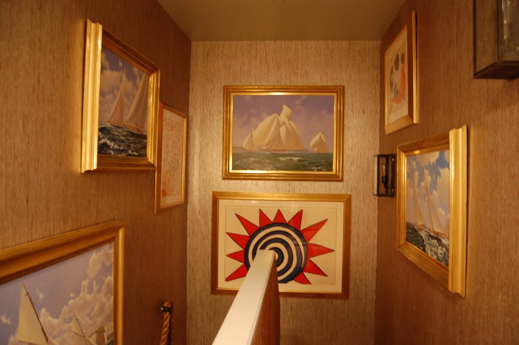 The stairwell acts as a gallery for more artwork.
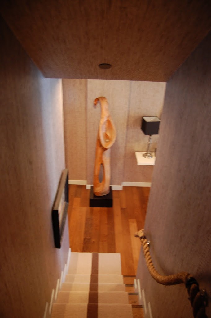 I apologize for the slightly blurry photo but I wanted to show how a beautiful sculpture is framed while you walk down the stairs.
 Back downstairs, you walk through the living room to reach the private garden outside. It’s like an oasis in the bustling city!
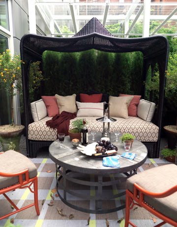
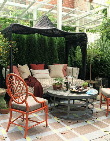 The pagoda style daybed from Mecox adds a little privacy to the private garden since people in other apartments look down on the space. In the photo from House Beautiful, they have pulled up the more colorful chairs from the other seating area.
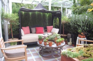 When I visited, the other chairs were surroundeding the table. There is also a potted tree in the space for more privacy.
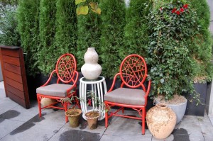 Here you can see where the coral red chairs usually reside. There is actually a lot of seating in the small area. You can also see the door that leads from the common garden area to the private garden. I really enjoyed seeing this showhouse and although I should play favorites, I think it was the one of the three Designer Visions showhouses that I enjoyed most. It really felt like the space was home to real people. I’m so glad that Thom Filicia was inspired by The Big Chill. It was a perfect choice and he created a perfect home for The Coopers!
 Photos by Thomas Loof for House Beautiful and Heather Clawson for Habitually Chic
20 Comments
Gorgeous!Tom Filicia is terrific. I love the art and yes, the rope railing and runner is so unique,. The charcoal walls too, so ,many great details to take in…..
The ART alone draws me in…I’m really starting to see it as a crucial factor in decorating- it adds so much life! And that bookshelf/bar, how brooding gentlemens club.
Wow, there are so many things to love about this show house!!
Thom Filicia rocks!
I thought the way he treated the television by placing it behind the curtained wall was genius! The rope handrail with the offset runner was nothing short of amazing. I loved how he set off the bar with the books, mercury glass and painting in the background. Dynamic!
Thanks so much for the informative and personal tour!
Absolutely love the rope hand rail…, and have never seen anything like it before, not that bold anyway. It’s just so nautical.
Such beautiful spaces! It seems I have read lately of many movies, tv shows, etc. that have inspired many homeowners in their own designs. What a great idea to design a room for characters that have grown up past the movie they were in.
I love the earthy palette Thom chose for the house–beautiful and so stylish! The bone poster bed is a favorite I mine–I recently blogged about it-stunning show house and lovely story!
much of it isn’t quite my style, but still SO beautiful. i especially love that rope – and the bedroom with the white stripes (and everything else in the room).
I just love this! My favorite is the Robert Moody painting, that whole little bar area along with the painting really grabs me. So jealous you got to see it in person :o) Great post!
Thom is uber talented! His interesting color combinations and strokes of unexpected elements like striping the walls and great accessories keep rooms from looking “decorated”. A great post Heather like always!
Beautiful, awesome post!! Loved and enjoyed viewing it all
so many wonderful things to like. i don’t know where to start! i’ll just say…WOW. 🙂
I love all of these additional images. I agree, the art is fabulous…even though, I doubt that having a paper piece in the shower is a very good idea for its archival viability!!
I really loved the rope and staircase, but it reminded me of the big horse artwork in the dining room – kind of an interesting take on a cowboy feel – didn’t seem nautical to me at all.
Thanks especially for showing the two versions of the photos – hard to believe that even a show home needs “styling” for a photo shoot.
I love everything Thom does. Thanks for posting these!
Great post, totally inspiring. He is so creative and I like the risks he takes.
I have always loved Thom’s work, and he seems to be getting better with time!
I love the “Greek Peak” chair. So many of the small details are what makes these spaces work.
Thank you for posting.
David @ Ashfield Hansen Design
Finally, a house that looks like it’s been LIVED in. Bravo, Thom.
I loved the forest wallpaper! Such whimsy. Where on earth could I find something like this?
He is really good about outside the box design. He pushed the envelope in a good way.
Heather, Thanks for posting this. I was responsible for the garden. These pictures look fantastic better than the editorial. Marna Ringel – Flowers by Marna