Chic Designs: Sophie Conran for Portmeirion
by habituallychic
10 . 26 . 07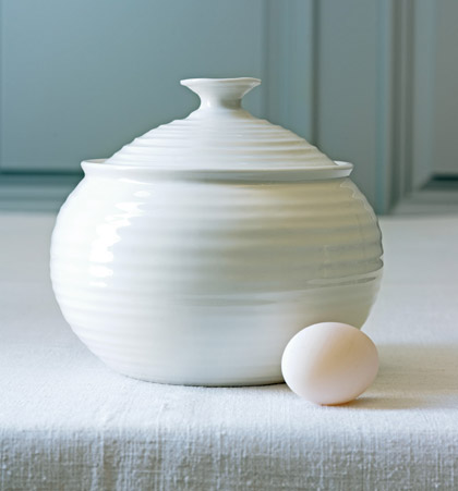
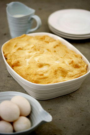
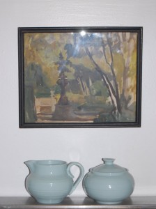
One of the first things I put on my Christmas list this year is Sophie Conran‘s Collection for Portmeirion. I already own a few pieces including the sugar bowl and creamer that sit on my stove (see last photo) but now I want the place settings. Actually, I want the whole darn collection. Every last piece! But only in pale robin’s egg blue. It’s my favorite color and matches my decor perfectly. I love that they all look slightly off kilter and handmade, although I’m sure they are not but it’s nice to know something mass produced doesn’t have to look like it!
Sophie Conran is the daughter of Sir Terence Conran, the famous designer, and is a cookbook author as well as designer now herself. She said she believes in enjoying every moment and in creating a beautiful world around you and your family, with warmth, simplicity and love.
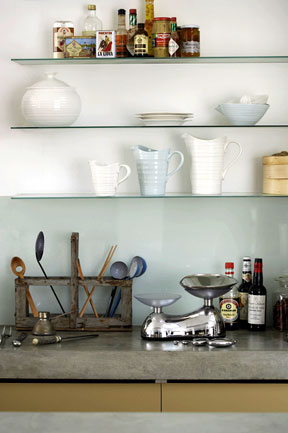
The Portmeirion Collection includes the porcelain which has been designed to look as good on the dining table as it does in the kitchen. They not only look great but are robust and can go from the worktop to the oven to the table to the freezer, and back to the oven again. Love it! There is also glassware, silver serving pieces, wood pieces, and aprons and tea towels. Oh, and it’s also a design winner! Sophie’s collection won the Elle Decoration Design Award in 2006. So I guess I’m not the only one who appreciates it. There are many stockists who carry the collection including Anthropologie, Macy’s and Amazon.com. Just in case you want to put in on your holiday wish list as well.


12 Comments
These are beautiful! Is the picture in your kitchen a Julian Barrow?
Is there anything this family cannot do?
I love this collection as well and am also a huge fan of Jasper Conran for Wedgewood and Stuart Crystal.
These are gorgeous. The pale robin’s egg is perfect – my favourite colour also. I always seem to come back to combinations of that and coffee. Like you, I love that they’re slightly off kilter, but they still manage to be clean-lined and not at all craft-shoppy. Uh-oh, I feel myself becoming ensnared!
I was so smitten with this that I ran down to my local China store. Guess what? The whole collection is on sale and just as beautiful in person. I’ll probably buy it next week – I’ve been looking for perfect new China!
What a talented family they are indeed, and I have to admit I’d not heard of Sophie before. They are lovely pieces.
I know a couple who put the white set on their wedding registry. I tried to not like it, because of personal reasons, really, but, I have to admit, that the simple and elegant sophistication is there. I don’t know if I’d like all white, like they have, I think it may be kind of boring, but if you have, say, three colors, it can be charming and sweet. I don’t think I’d mix and match the pieces, rather, keep them together and place them on the table with their set. Maybe the blue, the beige and the white, or maybe the green, the blue and the beige. We’ll see.
Hi.
ps. I went to Macy’s and got 4 place settings. One in each color. Brought them home and put them out on the table. My suggestion to anyone who likes the set and has not decided on color(s) is try them out in the light of your home or apartment. The colors are affected by the light. The sage looked beautiful in Macy’s-very dramatically lit as they can be in a china department; on my table it was sort of dull and couldn’t be that differentiated from the blue. I ended up keeping the blue, the white and, believe it or not, the “biscuit” or beige, which, when I saw it in Macy’s thought it was not beautiful, but in the natural light, is quickly becoming my favorite. Definitely a comfort color-sort of like the color of coffee ice cream or cafe au lait.
I am anything but “in the know” when it comes to style, fashion or design. I am moving into an older home with a country kitchen. A lady in Fortunoff told me that this is a very contemporary collection but I think it would look great in my kitchen. Is it only considered contemporary? With that pottery-like design I thought for sure this would work in a country setting. Am I wrong?
Anonymous 10:39pm – I think the appeal of the pottery is that it can work in any setting! If you like it, that’s all that matters so don’t let the salesperson discourage you from buying it!
Thank you!
I feel better about my choice! I love the glassware as well. I cannot wait to put it on my wedding registry!
I think it’s contemporary, yet shabby chic, elegant, yet simple.
btw, they are coming out with a new color this winter. It’s a pretty shade of periwinkle. I think they are calling it forget-me-not, but I could be wrong.
I do have a problem with them introducing new colors over time. One could buy a 10 or 12 piece place setting on what they have at the time, and discover a color down the line that they like better. It’s just not fair and the wrong way to market the line, if you ask my opinion.