Design Inspiration
by habituallychic
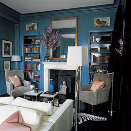
02 . 11 . 08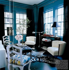 I know you’ve all seen this Miles Redd designed apartment before but it’s one of my favorites in terms of color inspiration. One of my living room walls is painted a similar peacock blue color and I keep thinking about incorporating the John Rosselli silk Ikat fabric into my scheme. I’m in the mood to redecorate or at least re-edit and/or rearrange my apartment. But of course, that means I need to find the time and that is easier said than done so I guess I’m stuck with what I’ve got for a little while longer. Sigh.


22 Comments
Love the colour, and I love that Ikat! I’m kinda in the same boat at the moment, but we are fortunately changing apartments in a few months. Even if I can’t redecorate, I’ll be able to rearrange!
Yum. The saturation of gorgeous color on floor and walls in the first photo is so beautiful.
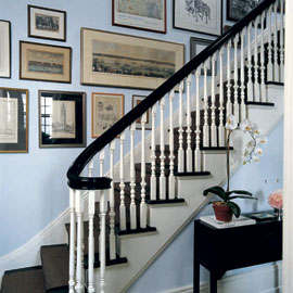
I love the silver-gray walls. Like living inside a pewter mug.
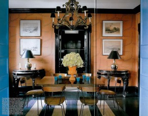
dreaming of a blue dining room…
lovely blue post… nice photos!
Your blog is my design inspiration. The dining room pictured is beautiful. Dreaming is easier than redecorating.
Suzy, I almost wish I was moving so I would be forced to go through things and then be able to redecorate. I just have to force myself to make the time I guess. I hope you will show us photos of your new apt when it is finished!
Diana, I love the living room! I think the only I would do differently if it were my home is paint the trim white.
Thanks Patricia! I think it also makes me think of spring which I deserately need on this coldest day ever!
An Aesthete’s Lament, I love that room too! I especially love the high gloss finish to the walls. It’s a great trick that we use a lot in NYC because it reflects light in small dark spaces. I also love it on a ceiling!
Linda, you are so right!
ok, i really, really, really, really want to repaint my living room a deep, saturated green-y blue. my need is almost driving me crazy, and your post has not helped!
thanks for posting the pics, and strengthening my resolve!
i have to say, i love that TOP PIC, its one of my favorites. I have it hung on my inspiration wall in my office. Good choice!
Jen Ramos
‘100% Recycled DESIGNER Cards’
http://www.madebygirl.com
love your blog!! i’m actually leaving NYC to move back to North Carolina…so great reason to re-decorate!! would love to know if you have any ideas about the color of the HALLWAY? i am searching for a great “light blue” to do my dining room and great room in (also similar look to steven sclaroff’s kate spade apartment)
warmest, kristye
We painted one LR wall a similar semi gloss blue but a bit more gray to it, the the rest of the walls in a paler whitish blue. The colors work well with the following in a redish brown mahogany wood: built-in floor to ceiling cabinet, 6″ baseboards, and window/door frames. It is stunning. Very stately, rich and wonderful – the room seems to envelope you. Quite cozy! We have a similar deep orange (like in your pics) and a gray-taupe against white cabinets in our kitchen. Crisp, clean and warm yet modern and chic. I smile everytime I walk in – even with a sink full o’ dishes! Everyone should have a little color in their lives.
p.s. You blog is a pleasure to read everyday and candy for the eye. – Shelley
Gorgeouse apartment! Love the colors used!!
Maison21, You definitely have to share photos if you decide to paint! I rent so I wan’t supposed to paint at all so I only painted one wall. I love how everything white pops against it!
Jennifer, Julian Schnabel is very inspirational isn’t he?
Kristye, I find giving paint color advice so hard over the internet because it all depends on the light in your home and if the other colors are warm or cool in tone. I would probably go with a paler shade so you don’t create a dark hallway though and you should probably do a few test patches to see what works the best!
Jennifer, Oops. I thought I replying to comments under the Julian Schnabel post. It’s been a long day! Sorry about that.
Shelley, I am impressed that you have so much great color in your home. I feel like so many people are afraid to take risks and try something. I certainly didn’t pick the right shade the first time but even decorators make mistakes. That’s part of the process and the fun. My bedroom is robin’s egg blue and every night when I lie in bed reading, I love how pretty it looks. It makes me happy too!
M&Co. Glad you like them too!
Stumbled on your blog when seeking answers to the Blogger spell check issue and thought I’d stay and check it out. This apartment struck me… its awesome.