Bachelor Pad Chapter 3: Painting Predicament
by habituallychic
05 . 31 . 08 I hate choosing paint colors. I think it’s the hardest part of design. I’ve had a lot of people email for paint color recommendations and I always tell them that paint looks different in every space and in different light and at different times of the day. It’s really a crap shoot and on my bachelor pad gamble I did ok but I wasn’t perfect.
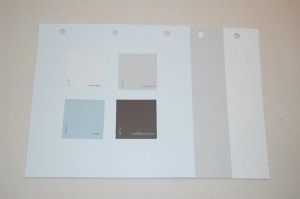
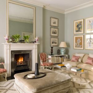
The painters started yesterday and I could already tell that Horizon (OC-53) from Benjamin Moore was going to be too light in the bedroom. Then today I stopped by and realized that perhaps Collingwood (OC-28) might also be a little too light but Middlebury Brown (HC-68) in the entry looked amazing. The bathroom in White Ice (OC-58) looked fine, as did the kitchen in White Dove (OC-17).
It was decided that we had to go darker in the bedroom so I spent most of my Saturday at the Janovic Plaza/Benjamin Moore Paint store where I am on a first name basis with my helpful salesperson Shawn. I picked out three colors that I had made up in quart sizes to try on the wall and Smoke (2122-40) was declared the winner. It works very well with the other colors so there will be a nice flow through out the space. Luckily, the painter said he would repaint the bedroom for a reasonable rate so it didn’t turn out too bad in the end.
The moral of my story is that everyone makes mistakes with paint. It’s not the end of the world but mistakes do cost money so it’s sometimes best to try the sample pots or have quart sizes made up first. This probably also means that people will stop asking me for paint advice which might not actually be a bad thing!


12 Comments
Hi Heather,
Paint is tricky, but makes such a tremendous difference. It sounds like you are making great progress; can’t wait to see the ‘after’ photos.
By the way, I just started a new blog that you may want to check:
http://breathingdreaming.blogspot.com/
I’m still trying to figure out how to add links, etc, and then I’ll be sure to add your blog as a favorite.
When choosing paint colours… besides trying the samples… you can preview colours with computer generated programs and digital pictures.
I can’t wait to see your project… I’m sure your paint choices will be great.
Your right – paint is a hard choice.
My bedroom was easy but the living room, dining room/kitchen with cathedral ceilings that all flow together proves to be a more difficult decision. I think I definitely have to paint some sample patches on the walls.
truer words have never been spoken!
paint is the easiest and cheapest thing you can do to decorate a space, but also one of the most challenging. a cute mirror will look great in ANY room, but paint color changes in every single space you use it in due to the light, size of the room, furnishings, flooring- there are so many variables, it can drive one mad.
i just put up some test swatches in a client’s entry, and they were DREADFUL (so pretty as a tiny chip). the minute i slapped them up, i regretted even trying them- they were so ugly i was embarrassed. luckily, they were just swatches, but the sad fact is sometimes a swatch can look fine and then when you paint the whole room, somehow it just ain’t right, so the whole thing needs to be redone. happens even to the best of us- read any decorating magazine and you’ll see the quotes “we went through 8 shades of red, before we found one just right for the space”.
i always try to warn clients of this in advance, especially when dealing with darker, saturated tones- sometimes it just takes time, patience and little more money than expected, to get it right. can’t be avoided!
i’m sure your end results will be fabulous! and even if you have to paint every room twice, then what the heck- your client is still getting the biggest bargain in town!
yyour blog iss so faab
Ugh. I know. I struggle with it every day for clients, myself, bla bla bla. I worried a bit for you when you said Horizon, I thought it might read too light but you never know someone else’s thoughts! Sounds like its starting to really come together!
Even hearing about painting mistakes make me sort of quesy. Paint is cheap but painting is a lot of work so redoing a color is a real pain but so worth it in the end. The wrong paint color on the walls throws off the whole room. Im sure it will look gorgeous when you’re finished. Can’t wait to see the “afters”.
Hi Heather
Have you ever used a “paint map?” Our Editor Jane (the other Jane) blogged about how she made one for her current painting project. If anyone is interested in reading more about the concept, click the atticmag name and on the home page go to Editor’s blog. The paint map entry is towards the bottom of the page.
I also just discovered websites that will generate color palettes based upon an image you upload. I’m doing it with rugs, and it’s been quite interesting to see how it all works.
You sound like you’re really on a roll with the remodel project.
Best, Jane 😉
Hi Heather! This is my first time commenting on your blog but certainly not my first time reading. I so love your posts! You are a true inspiration. The colors you chose are beautiful. All look to become a wonderful clean palette. I agree with Maison. Sometimes finding a color you have in your mind just doesn’t translate in the space. I own a boutique and when I first found the building I had a visual idea of what I wanted to convey as far as the interior shell. Blues and browns and greys. Boy, was I in for a lot of frustration! HUGE waste of time. The problem was there are two areas in the space that get entirely different lighting. Long story short, I gave up on blue and went with a beautiful soft grey green with accents of brown. It turned out perfect! I took from that experience that the store that allows you to purchase sample paint so you can actually see a color on the wall is the store that gets my business! Anyhoo…..I can hardly wait to see your projects end result. No doubt it will be magnificient!
Love ya!
Carol
I agree…Paint is tricky – changes with every hour of the day. I have made a habit of ordering 4, 5, 8, or even 10 large swatches from the Ben Moore website (some are 5 x 9 and others are 8 x 8 depending on whether they are classic colors or Color Preview)and they’re free!! I tack them up in different areas of a space to evaluate them in different lights. While it is still not fool-proof, at the very least, it is a great tool to eliminate some candidates. Ben Moore is the best – I love that they allow you to order large swatches at no charge, and they ship them VERY fast. Also, I always consult the Ben Moore Historical Colors first…Then I look at the America’s Colors…then the rest of the fan. Just my 2 cents…
So funny to be reading this after my weekend. I ended up chosing the wrong white for my place, and now my husband is getting impatient with me because I want to change it before we finish. But I figure, if I don’t change it now, I’ll regret it, and if this is part of what I do for a living then I’d better get it right, or no-one will ever ask me for any decorating advice! So, I’m so glad that I’m not the only one in this boat.
Good luck, I’m sure what you go with in the end will look fab!
My rule of thumb is this: Jump up and down over the color chip you love but when you buy the paint, go one shade darker than you planned. It always works.