New Wave
by habituallychic
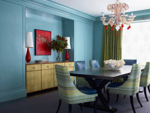
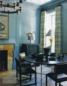
01 . 17 . 09 A reader asked the name of the fabric that Katie Ridder used on the back of the chairs above. It’s called New Wave by Old World Weavers and the color is Capri (AB 0003 6512). It’s available from Stark in New York but was out of stock today when I stopped by with my friend Eddie Ross. I was told that it’s very popular and this is evident by the fact that Steven Gambrel also used it for the draperies in his new townhouse, below. It’s a very beautiful fabric and I look forward to using it someday too. But first I have to wait for my sample to arrive!


14 Comments
I absolutely adore the chandelier in the 1st photo! Gorgeously colorful room!
It’s interesting that they both have blue backgrounds.
Designers many times try to do something that nobody else has, but sometimes a good idea is a good idea isn’t it!
Love this fabric- very Missoni.
Lovely, it reminds me of the “bargello” stitch-pattern in needlepoint, that and Missoni.
Both rooms are very beautiful. I love that they are both blue..different but similar..It is neat to see the fabric used in two totally different applications with an equally beautiful result!
Funny- as I am normally don’t say that I don’t like things- but to me when the fabric is on the back of the chairs is becomes very LOUD and almost in your face with the Katie Ridder photo (and I ADORE her work) but then when you look at the Steven Gambrel (who is a god…SWOON) the fabric almost becomes more QUIET and doesn’t jump out at you when used in the window treatments. So for me personally the Steven Gambrel application is my favorite. It always amazes me how you can take the same fabric and use them in different applications and have such a different result and feeling. Thank you so much for sharing the comparison. Happy Saturday! Stay warm back there. Cashmere layers for you!
simply lovely.
hmmm…don’t know I feel about this one…although I love the space plans, the idea of upholstered chair backs and the furnishings!
Best,
Michelle
Love the fabric — is Old world weavers Iris Apfels company?
I also looove the blue in Katie Ridders apt — any idea what the color is?
I love the chandelier in the first picture, great contrast to the blue walls.
Thanks for info. regarding pattern used – I find this to be valuable info. when reading design blogs. I also agree with Gibson’s comment regarding the use of the same fabric having different effects. A beautiful fabric doesn’t always ‘come to life’ in all settings. – KBN
What a great fabric and I love it with the blue walls. Stunning! Great blog!
Oh my gorly, he is gorgeous! I am not a fan of the chalk board paint, love the color of chalk board but hate the chalk part. Makes me sneeze and I am not pretty when I sneeze. Oh, I love your blog! Kisses!
Old World Weavers was founded by Iris Apfel but is now owned by Stark Carpet