2009 Kips Bay Show House Designer: Eileen Kathryn Boyd
by habituallychic
04 . 20 . 09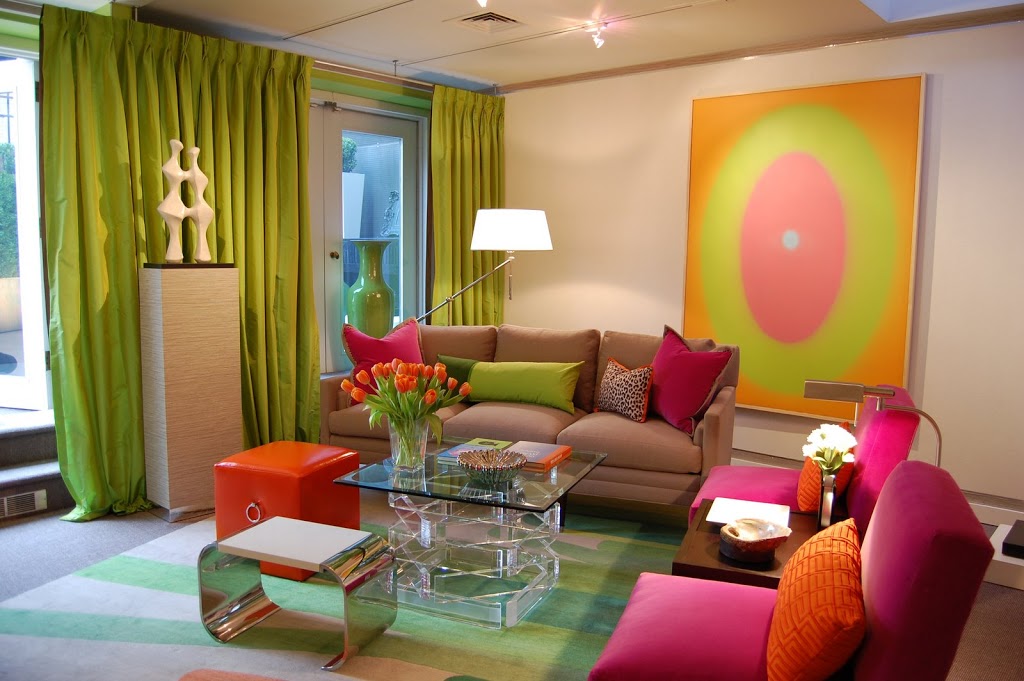 Now that the weather has turned cold and rainy again, it’s time to get back to my Kips Bay Decorator Show House coverage! The room next to Donald Schermerhorn’s on the 5th floor was designed by Eileen Kathryn Boyd and although it’s very different, it’s equally as beautiful! When I mentioned to Eileen that I don’t tend to use a lot of bright colors but I love this room, she attributed it to the neutral background. The walls, sofa and main carpet all neutral and keep the room from becoming too much. It’s also a great idea for the average homeowner because if you kept the bases neutral, then you could switch out the pillows with different colored options if you wanted a change.
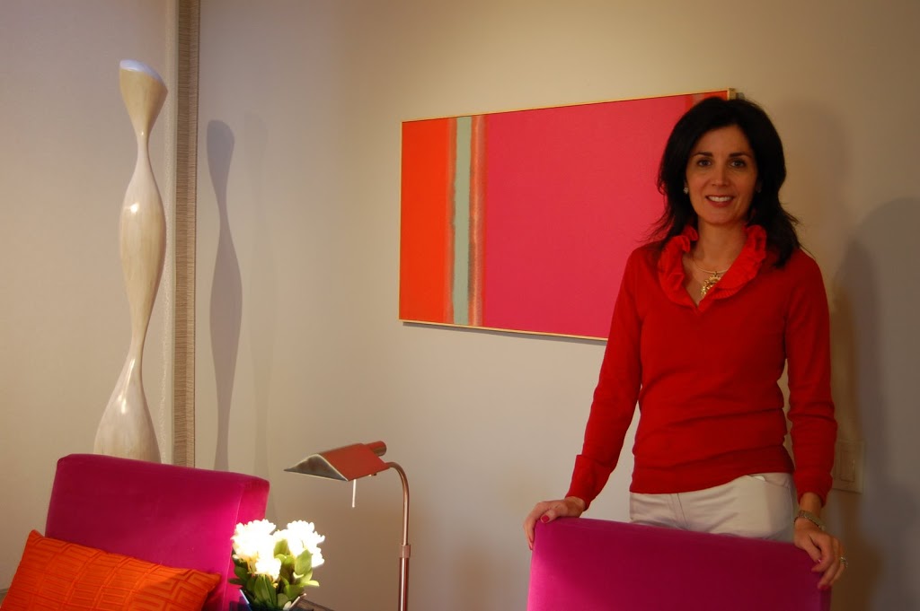 It’s really a shame that not everyone can speak to the designers when they tour the show house because that really is the best part! I had a great time meeting Eileen and chatting with her about her room and art and design. I already mentioned that the art this year is top notch and I absolutely love all the pieces that are in this room. I also love that for every event last week, Eileen’s outfits matched the room! That is definitely something that I would do if I had a room in a show house and it makes for very well coordinated photos!
 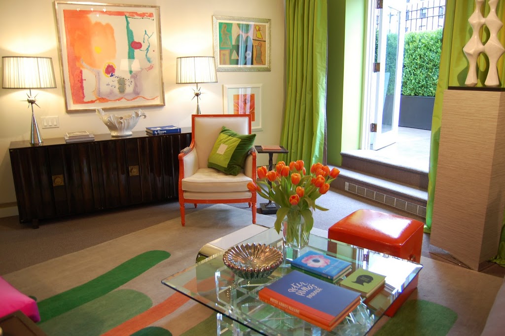 Eileen knew she wanted a springy room that would reflect the season and that would be cheerful. That drove the color palette which a perfectly designed area rug from from the Rug Company helped pull together. Another takeaway idea is that Eileen painted the frame of the bergere chair a glossy orange color. That is something that anyone could do to spruce up a flea market find very inexpensively. I really love this bright and happy room just as much as did Donald Shermerhorn’s serene space and I think that’s a testament to the design skills of Eileen Kathryn Boyd and why I love show houses! They really do expose you to new and interesting ideas in addition to benefiting a worthy cause. What could be better than that?!


9 Comments
Such fun colors and great art in that room. I wish I could see the show house this year but can’t make it to NYC right now. Love reading about it through all of your posts! Great job Heather & Thanks!
Personally – one of my faves – the punchy pops of color in the art, the flowers, the furniture. Reminds me of happy times in Manhattan, a city that can often leave one gray and cold – how fresh to come home to this zesty space!
pve
i loved how she framed out the walls with the edge detailing. of course, as usual, i’m going to ask you- do you remember what is was? so hard to identify stuff like that from a photo.
no biggie if you don’t remember.
can’t wait for the next installment (there is one, right?)
Amazing colors!!! Before moving, I had a client in Amsterdam who was looking for very color scheme! She gave me two bits to go on… “I want lime green and orange and lots of antiques…” I’m sending your pics off to her now, for some extra inspiration on last minute details to add to her abode.
This my friend is a room you could ONLY be happy in!
Thanks,
Toma
I have an obsession with chairs – the orange and cream chair is delightful!
Laura – It’s too bad you can’t see it in person! But I will try to bring you as much as I can!
PVE – what’s funny is the weather was grey the day I was there and this room still looked cheerful and bright!
Christian/Maison21 – I wasn’t sure anyone was going to be able to see that detail in the photos so I didn’t bother mentioning it! Leave it to you to spot it with your eagle eye! Eileen pasted up a strip of wallpaper around the room. It was about 1.5-2″ wide and matched the paper she also wrapped around the pedastal that holds the statue. It looks like inlaid wood. I don’t remember discussing the silver/chrome edging but she must have added that too. Hope this helps!
Toma – how perfect! I hope the photos help her with her design!
Kellie – Orange is my favorite color so I loved the orange chair and little orange ottoman too!
I would have never expected to like this room if you had described it. but LOVE.
thanks chic! i couldn’t tell if it was a combed wood molding, or a paper. (sorry if my nit-pick questions drive you crazy, btw, but the little details are what fascinates me in the work of others- always looking for stuff to steal!).
i am loving this room more the second time around- all that color- my kind of gal!
I LOVE this room – how happy and energizing. I can’t get it out of my mind. Thank you so much for bringing it to us!!!