A Fashionable Townhouse
by habituallychic
02 . 11 . 10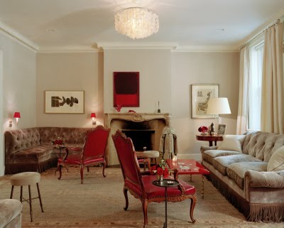 The mood board that I posted yesterday with the Rothko painting reminded me of Allison Sarofim’s amazing West Village townhouse. I just came across the article about it that I ripped out of the February 2004 issue of Vogue so it was perfect timing.
 I was under the impression that David Netto had designed the entire townhouse but turns out that he just helped design the modern white basement room for watching movies and hanging out. Allison actually worked with her friend Miles Redd to design the other four floors of her townhouse. I also found out that the previous owner was model Linda Evangelista. So it really does seem like a great space to post on the first day of fashion week.
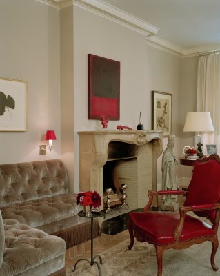
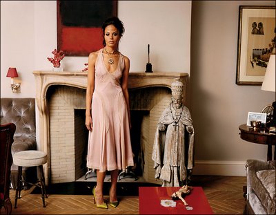 This photo of Allison gives you a better sense of the color of the living room. The entire home was inspired by many sources including by the de Menil house in her native Houston which was designed by Phillip Johnson in 1950. Another inspiration was the film Bell, Book and Candle which I have never seen but is going at the top of my queue now!
 In the Vogue article by Hamish Bowles, Allison says, “my main objective was to create a subtle, clean-lined backdrop so that the artwork and interesting pieces of furniture would really pop.” The living room color also matches the paint color of the walls of Marc Jacob’s Paris apartment.
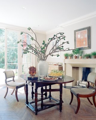 Allison originally trained as a chef so a lot of thought was put into the design of the kitchen and dining room. She also contributed to Domino magazine and acts on occasion. I couldn’t find any good photos of the garden which was modeled after the garden courtyard at the Museum of Modern Art, right down to the Bertoia chairs.
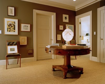 I don’t know why I was surprised that the interiors are so traditional but they way they are designed with less furniture and “stuff” make them very modern.
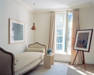 This room is one of the most simple but it’s definitely my favorite. But then again, how can you go wrong with a room that contains a Twombly, a Vuillard, an antique daybed and a vellum table. I also love how the soft silk rug looks layered over the sisal carpet. It probably also feels great under your feet when you get up from a nap on the daybed!
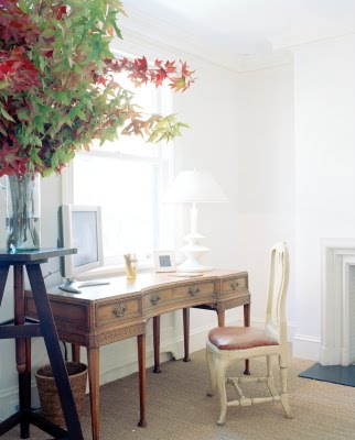 Less is more in the office area as well.
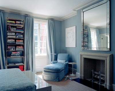 The master bedroom was upholstered in soothing blue silk just like Allison’s mother’s bedroom.
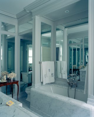
 I’m surprised I didn’t realize Miles Redd had a hand in this home after I saw the mirror and marble bathroom!
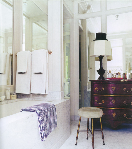
 I know furniture and art can be tricky in the bathroom because of the steam but I love treating them like the other rooms in the house by adding them in. You just might want to make sure they aren’t priceless antiques and artwork!
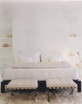 The basement is where designer David Netto lent a hand. All the areas, including an extra bedroom are clean and white.
 I just had to research screens and projectors for a project and I can tell you that they aren’t cheap! But it would be fun to have a basement screening room to watch movies.
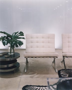 Even though the room is white, it’s not boring since all the pieces are varying shades of white.
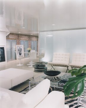 I like that the back walls looks like it’s the original brick. The Chuck Close work isn’t too shabby either.
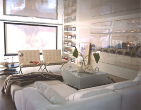 The zebra rug and fur throw also help to warm up a white space that could end up looking very cold.
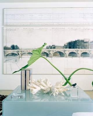 I wish I had the information about the artwork. If anyone knows who it’s by, please let me know! Funny how the coffee table looks blue in this shot and clear in others too.
 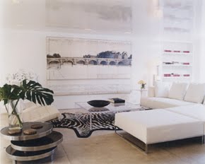 I don’t usually like such modern looking rooms but I actually think it would be fun to hang out in this one, especially since the rest of the home is more traditional. I think it’s also fun that they styled the room as an homage to Eileen Gray, below, for Domino. Since they are no longer around, I hope Vogue will continue to feature fabulous and fashionable homes like this one each month! Happy Fashion Week!
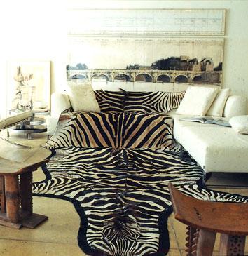


16 Comments
that purple drawer is exactly like one i saw in london, and cursed since it would have cost me loads to import it to sweden… but it was a beauty!
I have been reading Vogue for years, but don’t remember seeing this. Thanks so much for posting…Her townhouse is amazing! That banquet, the artwork, Chuck Close and Twombly (which I wish I could see better). Its all so good!
The artwork in the house is the PONT NEUF by Chisto. He wrapped the Pont Neuf in Paris in the late 70’s early eighties I believe, and made a fabulous sketch of it. This is surely a limited numbered “tirage” by Cristo. They also had a double page print of it in the International Herald tribune the day of the opening of the expo that you could ask Cristo to sign if you went to the barge on the Seine he was hosting the launch party on. My sister through a friend who was the Paris bureau chief for the Chicago Tribune was invited to the party and has framed the I. H. T signed page and has had it on a wall ever since. Fun story.
The artist is Cristo and thats the pont neuf I think.
You are definitely right – less is more makes this traditional look feel very modern. Beautiful. Marija
The only think that bugs me is the teeny table between the red chair and the banquet. It would be a great place to hang out during a party but where to set your cocktail down?
I absolutely love the herringbone floors in the dining room/kitchen picture and the room with the day bed. Just wonderful. And yes, Miles does love his David Adler-esque mirror and marble bathrooms!
There are some great chairs! I love the nail head chairs in the living room and the bright pink ones that match the coffee table in the first two images.
Do like the red Chairs lovely townhouse. The zebra is fun and of course Art by Cristo .
Enjoyed it…
yvonne
I like the fact that the rooms evoke different feelings, a different ambiance. Some classic and soothing, some definitely more modern and jazzed up. Great home.
H,
thank you for this.
i loved it.
x
Of course I love this post, and I also love the lived in look of this townhouse.
Great post for a snowy day. Yes, we are having snow in the south today! WooHoo!
Teresa
Beautiful. I think the design successfully let the artwork shine. Thank you for sharing.
I believe the artwork is of the Pont Neuf in Paris, would love to have it. What a wonderful dreamy apartment. Thank you for showing.
What a fabulous home! I was just drooling over a white Barcelona chair like the one in the basement in this month’s Elle Decor and thought it a perfect piece – it can in both a tradional or modern setting. Love to get one instead of roses and chocolates this year!
That may be the chicest basement ever! Love the screening room.